PRODUCT
PRODUCT
PRODUCT
Service:
Digital
Type:
Product
Industries:
Ecommerce, Hospitality, Retail
Year:
– 2026


OVERVIEW 01 MOBILE E-COMMERCE
OVERVIEW 01
MOBILE E-COMMERCE
PET DESIGN • CONVERSION OPTIMIZATION • I0S APP
PET DESIGN • CONVERSION OPTIMIZATION • I0S APP
How do you sell premium bikes to research-obsessed, choice-fatigued buyers on mobile without losing them to decision paralysis or checkout friction? The answer: a shopping experience built on Persuasion, Emotion, and Trust.
MY ROLE
End - to - End UX Designer
End - to - End UX Designer
PLATFORM
Mobile iOS App
Mobile iOS App
METHODS
Research Wireframes / Usability Testing Hi-Fi Proto
Research Wireframes
Usability Testing Hi-Fi Proto
Research Wireframes / Usability Testing Hi-Fi Proto
USERS SAID TOO MANY PRODUCT OPTIONS MADE IT DIFFICULT TO CONFIDENTLY PURCHASE A NEW BIKE ONLINE.
ALL PARTICIPANTS SUCCESSFULLY COMPLETED THE FINAL ROUND OF USABILITY TESTING TASKS.
TESTERS SAID THE RIDE FINDER FEATURE HELPED THEM FEEL MORE CONFIDENT IN THEIR PURCHASE DECISION.
PARTICIPANTS SAID TRUST SIGNALS LIKE FREE SHIPPING AND 24/7 SUPPORT REDUCED PURCHASE HESITATION.
THE PROBLEM
•
Choice Overload
Cluttered competitor catalogs overwhelmed high income buyers researching $2K+ bikes, causing dropoff before checkout.
•
No Mobile Presence
The brand lacked a dedicated mobile app critical for a 24-38 tech-forward demographic shopping primarily on phone.
•
Trust Gap at Checkout
Forced account creation and unclear return policies broke conversions before payment was ever reached.
KEY SOLUTIONS
THE PROBLEM
•
Ride Finder Feature
Choice Overload
Personalized bike matching by terrain, riding style, and experience reducing cognitive load at the top of the funnel.
Cluttered competitor catalogs overwhelmed highincome buyers researching $2K+ bikes, causing dropoff before checkout.
•
PDF Comparisons
No Mobile Presence
Account holders email comparison sheets with embedded cart links - one tap from decision to purchase.
The brand lacked a dedicated mobile app critical for a 24-38 tech-forward demographic shopping primarily on phone.
•
PET Persuasion Cues
Trust Gap at Checkout
Scarcity typography, social proof, hero imagery, and transparent pricing built urgency and trust simultaneously.
Forced account creation and unclear return policies broke conversions before payment was ever reached.
KEY SOLUTIONS
•
Ride Finder Feature
Personalized bike matching by terrain, riding style, and experience reducing cognitive load at the top of the funnel.
•
PDF Comparisons
Account holders email comparison sheets with embedded cart links - one tap from decision to purchase.
•
PET Persuasion Cues
Scarcity typography, social proof, hero imagery, and transparent pricing built urgency and trust simultaneously.
WHAT I LEARNED
This project taught me how to drive higher conversion, build brand loyalty, and strengthen user trust by applying PET Design strategies. I increased conversion through persuasive cues - typographic highlights that emphasized scarcity and social proof. To foster emotional connection, I incorporated large product hero images and a Ride a Finder feature delivering personalized recommendations. Trust was built through transparent pricing, 24/7 support, and perks like free shipping and account-holder discounts.
WHAT IT SOLVED
The app established the company's first dedicated mobile shopping presence, significantly enhancing the customer experience. A user-centered design approach introduced custom bike pairing suggestions based on riding type, terrain, suspension preferences, and experience level - making product discovery more personalized and intuitive. Part icon callouts on product pages further improved clarity, and PET strategies built stronger emotional connections reinforced by free 24/7 support and free shipping.
DESIGN PROCESS 6-PHASE SPRINT
PH.01
DISCOVERY
Personas • Competitive Audit
PH.02
ARCHITECTURE
Red Routes • IA Mapping
PH.03
LO-FI + TEST
Wireframes • Usability R1
PH.04
HI-FI R1
Color • WCAG AA• Proto
PH.05
VALIDATE R2
Guerrilla UT • 100% Completion
PH.06
FINAL POLISH
Hi-Fi Iteration Handoff

DESIGN PROCESS 6-PHASE SPRINT
PH.01
DISCOVERY
Personas • Competitive Audit
PH.02
ARCHITECTURE
Red Routes • IA Mapping
PH.03
LO-FI + TEST
Wireframes • Usability R1
PH.04
HI-FI R1
Color • WCAG AA• Proto
PH.05
VALIDATE R2
Guerrilla UT • 100% Completion
PH.06
FINAL POLISH
Hi-Fi Iteration Handoff
PH.01
DISCOVERY
Personas • Competitive Audit
PH.02
ARCHITECTURE
Red Routes • IA Mapping
PH.03
LO-FI + TEST
Wireframes • Usability R1
PH.04
HI-FI R1
Color • WCAG AA• Proto
PH.05
VALIDATE R2
Guerrilla UT • 100% Completion
PH.06
FINAL POLISH
Hi-Fi Iteration • Handoff

"The large bike images makes the design pop like I'm in the store."
— Ella • Usability Test Participant, Round 2
"The large bike images makes the design pop like I'm in the store."
— Ella • Usability Test Participant, Round 2
SPOKE SMITH • MOBILE APP • PET DESIGN
SPOKE SMITH • MOBILE APP • PET DESIGN
OVERVIEW 03
RESTAURANT DISCOVERY APP
FLAVOR PROFILING • ALLERGY MAPPING • RESTAURANT DISCOVERY
Generic restaurant apps surface the most popular, not the most personally relevant. Flavor Flux maps your actual taste preferences and allergy profile to surface restaurants that match how you experience food, before you ever read a review.
MY ROLE
End-to-End UX Designer
PLATFORM
Mobile iOS App
METHODS
User Interviews • JTBD • Empathy Maps • Hi-Fi Prototype
SURVEY PARTICIPANTS OFTEN HAD DIFFICULTY LOCATING NEW RESTAURANTS AND CUISINES OFFERING THE FLAVORS THEY TRULY CRAVED.
RESPONDENTS STATED FOOD ALLERGIES HAD PREVENTED THEM OR THEIR GROUP FROM
TRYING NEW RESTAURANTS OR CUISINES IN THE PAST.
SURVEY PARTICIPANTS REPORTED DIFFICULTY FINDING RESTAURANTS THAT PROVIDED FLAVORS EACH GROUP MEMBER CRAVED WHEN DINING OUT.
SUBJECTS ACKNOWLEDGED EXPERIENCING CHOICE OVERLOAD WHEN UTILIZING RESTAURANT DISCOVERY APPS OR SEARCH ENGINES.
THE PROBLEM
•
Flavor Discovery Gap
85% of participants strained finding restaurants serving the specific flavors they craved - tools search by cuisine, not taste.
•
Allergy Anxiety
Food allergies forced users and entire dining groups to avoid unfamiliar restaurants altogether, limiting discovery.
•
Choice Overload
Every interview participant felt overwhelmed by current discovery tools - scrolling endlessly without confidence.
KEY SOLUTIONS
•
Flavor Profile Engine
Users map personal flavor preferences like spicy, umami, sour, sweet, which the app uses to rank and filter restaurant results.
•
Allergy-Safe Filtering
Built in allergy profiling removes non-compliant restaurants before results appear, confidence before the first tap.
•
Group Compatibility Mode
Cross-references flavor profiles across a dining group to surface restaurants that satisfy everyone simultaneously.
WHAT I LEARNED
Without a style guide, I reverse-engineered The Address brand from their live site, extracting the color palette, typography, and layout to build a prototype indistinguishable from the real product, including exact replicas of active menus embedded in the consultation flow. Collaborating with a team under real client constraints pushed the solution further and faster than any solo effort could have.
WHAT IT SOLVED
Flavor Flux solved the root problem of restaurant discovery by enabling users to identify restaurants matching their specific flavor cravings and allergy requirements without manually analyzing every menu. Flavor and allergy profiling automatically filter all search queries, providing targeted, user centered suggestions that meaningfully reduce choice overload and surface dining options users can explore with confidence.
DESIGN PROCESS 6-PHASE SPRINT
PH.01
DISCOVERY
Audience Competitive Audit
PH.02
ARCHITECTURE
Site Map • Red Routes
PH.03
VALIDATE R1
Wireflows • Icon Library
PH.04
LO-FI + TEST
Color Flavor Infographic
PH.05
VALIDATE R2
Usability Tests • Iteration
PH.06
FINAL POLISH
Component Library • Handoff

"I have to go through all the search results even though it can be overwhelming at times."
— Nicole • User Interview Participant
THE ADDRESS • VIRTUAL STYLING •
VIDEO COMMERCE

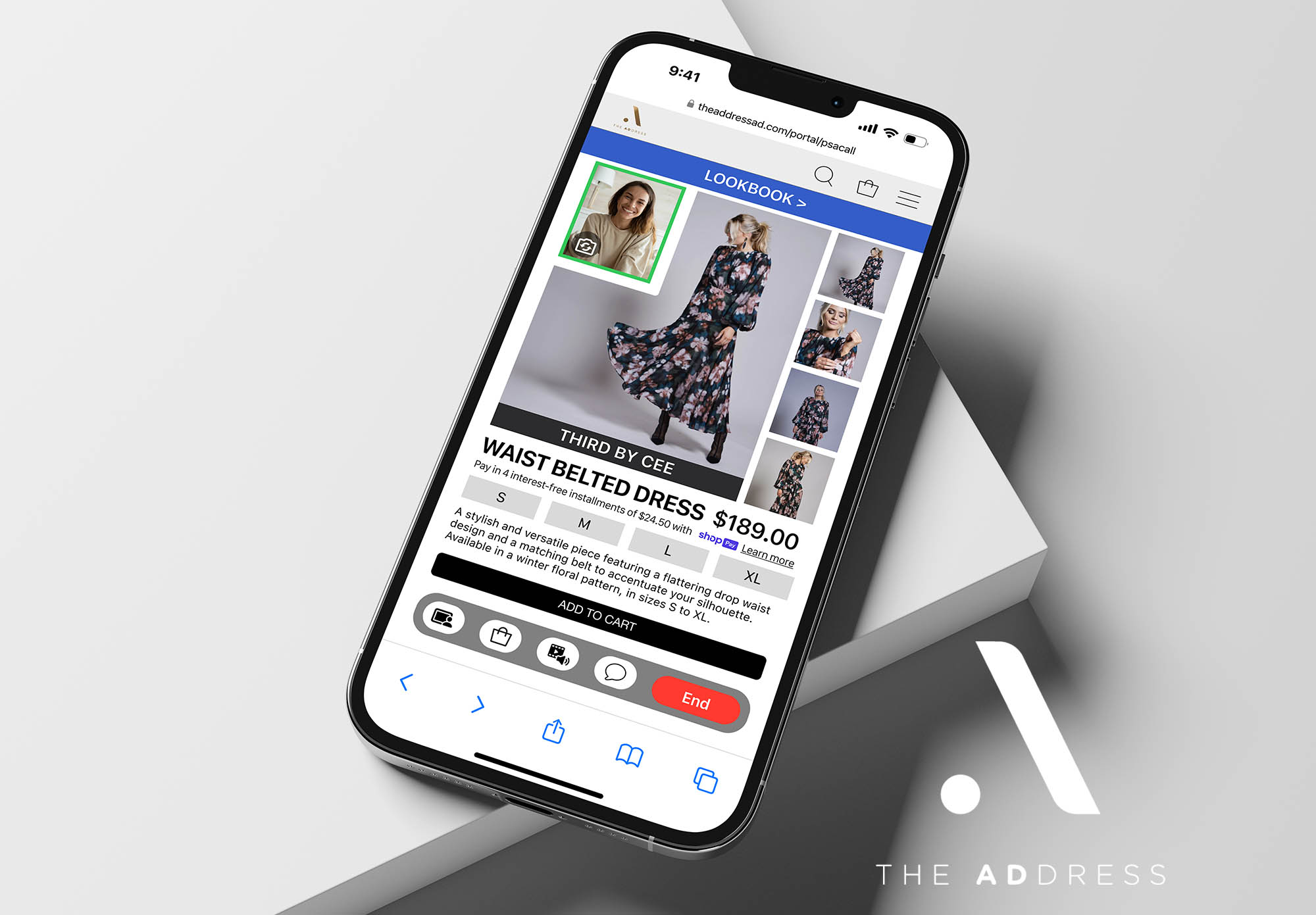
OVERVIEW 02 • VIRTUAL RETAIL APP
VIDEO COMMERCE • PERSONAL STYLING • B2B2C
Sales associates sit idle during slow in-store periods while remote customers go underserved. The opportunity: bring the white-glove consultation experience to faith conscious shoppers at home via live video.
MY ROLE
UX Designer / Collaborative Team
PLATFORM
Browser-Based App / B2B2C
METHODS
Competitive Analysis / Personas / Wireframes / Client Pres.
SURVEY PARTICIPANTS FELT THE CURATED OUTFIT SECTION NEEDED A WIDER RANGE OF STYLES AND LOOKS.
RESPONDENTS EXPRESSED A DESIRE FOR LARGER PRODUCT PREVIEW AREAS DURING VIDEO CONSULTATIONS.
PARTICIPANTS SAID UPLOADING WARDROBE IMAGES WOULD HELP IMPROVE THEIR CONSULTATION.
SURVEY PARTICIPANTS SAID THE SERVICE COULD INCREASE THEIR PURCHASING FREQUENCY OVER TIME.
THE PROBLEM
•
Idle Associate Hours
Sales staff lose productivity during slow in-store periods with no mechanism to reach and serve remote customers.
•
Underserved Niche
The Address is the U.S.'s first fashion department store for women of faith, its customers needed a curated digital channel.
•
No Consultation Tool
Existing video commerce tools lacked the high-trust personal styling experience the target audience expected.
KEY SOLUTIONS
•
Live Video Consultations
Associates deliver real-time personal styling sessions, mirroring the in-store experience through a structured a video interface.
•
Shoppable Session Cart
Products showcased during calls are added directly to a shared cart, removing friction between discovery and purchase.
•
Deposit Revenue Model
A client deposit applied toward purchases or retained if none made lets the store generate revenue even during off-peak periods.
WHAT I LEARNED
Working on The Address project allowed me to apply the full product development process while collaborating with a team of designers under real-world project constraints. Moving from ideation through high-fidelity design as a team enabled us to create a more robust, innovative, and user-centered solution by incorporating diverse perspectives and significantly accelerated the timeline compared to a solo effort.
WHAT IT SOLVED
The browser-based solution addressed the store's challenge of utilizing slow traffic periods by enabling sales associates to provide personalized remote consultations letting customers shop from home. The deposit model allowed the store to continue generating revenue even when no purchase was made, creating a sustainable business mechanism around an otherwise idle resource.
DESIGN PROCESS 6-PHASE SPRINT
PH.01
DISCOVERY
Audience Competitive Audit
PH.02
ARCHITECTURE
Red Routes • Wireframes
PH.03
VALIDATE R1
Usability Tests • Client Pres.
PH.04
HI-FI R1
Refined on Feedback
PH.05
VALIDATE R2
Usability Tests • Client Pres.
PH.06
HANDOFF
Final Deliverables to Client

"The sizing page was clear and straightforward, I didn't see the need for the body shape questions."
— Christina • Usability Test Participant
THE ADDRESS • VIRTUAL STYLING • VIDEO COMMERCE
OVERVIEW 02
VIRTUAL RETAIL APP
VIDEO COMMERCE • PERSONAL STYLING • B2B2C
Sales associates sit idle during slow in-store periods while remote customers go underserved. The opportunity: bring the white-glove consultation experience to faith conscious shoppers at home via live video.
MY ROLE
UX Designer Collaborative Team
PLATFORM
Browser-Based App / B2B2C
METHODS
Competitive Analysis / Personas Wireframes / Client Pres.
SURVEY PARTICIPANTS FELT THE CURATED OUTFIT SECTION
NEEDED A WIDER RANGE OF STYLES AND LOOKS.
RESPONDENTS
EXPRESSED A DESIRE FOR LARGER PRODUCT PREVIEW AREAS DURING VIDEO CONSULTATIONS.
PARTICIPANTS SAID
UPLOADING WARDROBE IMAGES WOULD HELP IMPROVE THEIR
CONSULTATION.
SURVEY PARTICIPANTS SAID THE SERVICE COULD INCREASE THEIR PURCHASING FREQUENCY OVER TIME.
THE PROBLEM
•
Idle Associate Hours
Sales staff lose productivity during slow in-store periods with no mechanism to reach and serve remote customers.
•
Underserved Niche
The Address is the U.S.'s first fashion department store for women of faith, its customers needed a curated digital channel.
•
No Consultation Tool
Existing video commerce tools lacked the high-trust personal styling experience the target audience expected.
KEY SOLUTIONS
•
Live Video Consultations
Associates deliver real-time personal styling sessions, mirroring the in-store experience through a structured a video interface.
•
Shoppable Session Cart
Products showcased during calls are added directly to a shared cart - removing friction between discovery and purchase.
•
Deposit Revenue Model
A client deposit applied toward purchases or retained if none made lets the store generate revenue even during off-peak periods.
WHAT I LEARNED
Working on The Address project allowed me to apply the full product development process while collaborating with a team of designers under real-world project constraints. Moving from ideation through high-fidelity design as a team enabled us to create a more robust, innovative, and usercentered solution by incorporating diverse perspectives and significantly accelerated the timeline compared to a solo effort.
WHAT IT SOLVED
The browser-based solution addressed the store's challenge of utilizing slow traffic periods by enabling sales associates to provide personalized remote consultations letting customers shop from home. The deposit model allowed the store to continue generating revenue even when no purchase was made, creating a sustainable business mechanism around an otherwise idle resource.
DESIGN PROCESS 6-PHASE SPRINT
PH.01
DISCOVERY
Audience Competitive Audit
PH.02
ARCHITECTURE
Red Routes • Wireframes
PH.03
VALIDATE R1
Usability Tests • Client Pres.
PH.04
HI-FI R1
Refined on Feedback
PH.05
VALIDATE R2
Usability Tests • Client Pres.
PH.06
HANDOFF
Final Deliverables to Client

"The sizing page was clear and straightforward, I didn't see the need for the body shape questions."
— Christina • Usability Test Participant
THE ADDRESS • VIRTUAL STYLING •
VIDEO COMMERCE
OVERVIEW 03 • RESTAURANT DISCOVERY APP
FLAVOR PROFILING • ALLERGY MAPPING • RESTAURANT DISCOVERY
Generic restaurant apps surface the most popular, not the most personally relevant. Flavor Flux maps your actual taste preferences and allergy profile to surface restaurants that match how you experience food, before you ever read a review.
MY ROLE
End-to- End UX Designer
PLATFORM
Mobile iOS App
METHODS
User Interviews • JTBD • Empathy Maps • Hi-Fi Prototype
SURVEY PARTICIPANTS OFTEN HAD DIFFICULTY LOCATING NEW RESTAURANTS AND CUISINES OFFERING THE FLAVORS THEY TRULY CRAVED.
RESPONDENTS STATED FOOD ALLERGIES HAD PREVENTED THEM OR THEIR GROUP FROM TRYING NEW RESTAURANTS OR CUISINES IN THE PAST.
SURVEY PARTICIPANTS REPORTED DIFFICULTY FINDING RESTAURANTS THAT PROVIDED FLAVORS EACH GROUP MEMBER CRAVED WHEN DINING OUT.
SUBJECTS ACKNOWLEDGED EXPERIENCING CHOICE OVERLOAD WHEN UTILIZING RESTAURANT DISCOVERY APPS OR SEARCH ENGINES.
THE PROBLEM
•
Flavor Discovery Gap
85% of participants strained to find restaurants serving the specific flavors they craved - tools search by cuisine, not taste.
•
Allergy Anxiety
Food allergies forced users and entire dining groups to avoid unfamiliar restaurants altogether, limiting discovery.
•
Choice Overload
Every interview participant felt overwhelmed by current discovery tools - scrolling endlessly without confidence.
KEY SOLUTIONS
•
Flavor Profile Engine
Users map personal flavor preferences like spicy, umami, sour, sweet, which the app uses to rank and filter restaurant results.
•
Allergy-Safe Filtering
Built-in allergy profiling removes non-compliant restaurants before results appear, confidence before the first tap.
•
Group Compatibility Mode
Cross-references flavor profiles across a dining group to surface restaurants that satisfy everyone simultaneously.
WHAT I LEARNED
Without a style guide, I reverse-engineered The Address brand from their live site, extracting the color palette, typography, and layout to build a prototype indistinguishable from the real product, including exact replicas of active menus embedded in the consultation flow. Collaborating with a team under real client constraints pushed the solution further and faster than any solo effort could have.
WHAT IT SOLVED
Flavor Flux solved the root problem of restaurant discovery by enabling users to identify restaurants matching their specific flavor cravings and allergy requirements - without manually analyzing every menu. Flavor and allergy profiling automatically filter all search queries, providing targeted, user-centered suggestions that meaningfully reduce choice overload and surface dining options users can explore with confidence.
DESIGN PROCESS 6-PHASE SPRINT
PH.01
DISCOVERY
Audience Competitive Audit
PH.02
ARCHITECTURE
Site Map • Red Routes
PH.03
LO-FI + TEST
Wireflows • Icon Library
PH.04
HI-FI R1
Color • Flavor Infographic
PH.05
VALIDATE R2
Usability Tests • Iteration
PH.06
FINAL POLISH
Component Library • Handoff

"I have to go through all the search results even though it can be overwhelming at times."
— Nicole • User Interview Participant
FLAVOR FLUX • DISCOVERY APP • FLAVOR + ALLERGY PROFILING
WHAT I LEARNED-
Working on the American Dream shopping mall's The Address project allowed me to apply the product development process I learned through the Springboard program while collaborating with a team of designers under real-world a project constraints. Collaborating from the ideation stage through to high-fidelity design enabled us to create a more robust. innovative, and user-centered solution by incorporating diverse perspectives. This collaborative approach also accelerated the project timeline, allowing us to develop a successful user-centered MVP much faster than a single designer could have on their own.
WHAT IT SOLVED-
The browser-based solution we developed addressed the store's challenge of utilizing slow customer traffic periods by enabling sales associates to provide personalized shopping consultations remotely, allowing customers to shop from the comfort of their own homes during these times. By implementing a service model that required customers to pay a deposit, which could be applied toward any purchases made as a result of the consultation but retained if no purchase was made, allowing the store to continue generating revenue even during low traffic periods.
VIEW THE ADDRESS CASE STUDY >
OVERVIEW 02 • VIRTUAL RETAIL APP
VIDEO COMMERCE • PERSONAL STYLING • B2B2C
Sales associates sit idle during slow in-store periods while remote customers go underserved. The opportunity: bring the white-glove consultation experience to faith conscious shoppers at home via live video.
MY ROLE
UX Designer / Collaborative Team
PLATFORM
Browser-Based App / B2B2C
METHODS
Competitive Analysis / Personas
Wireframes / Client Pres.
SURVEY PARTICIPANTS FELT THE CURATED OUTFIT SECTION NEEDED A WIDER RANGE OF STYLES AND LOOKS.
RESPONDENTS EXPRESSED A DESIRE FOR LARGER PRODUCT PREVIEW AREAS DURING VIDEO CONSULTATIONS.
PARTICIPANTS SAID UPLOADING WARDROBE IMAGES WOULD HELP IMPROVE THEIR CONSULTATION.
SURVEY PARTICIPANTS SAID THE SERVICE COULD INCREASE THEIR PURCHASING FREQUENCY OVER TIME.
THE PROBLEM
•
Idle Associate Hours
Sales staff lose productivity during slow in-store periods with no mechanism to reach and serve remote customers.
•
Underserved Niche
The Address is the U.S.'s first fashion department store for women of faith, its customers needed a curated digital channel.
•
No Consultation Tool
Existing video commerce tools lacked the high-trust personal styling experience the target audience expected.
KEY SOLUTIONS
•
Live Video Consultations
Associates deliver real-time personal styling sessions, mirroring the in-store experience through a structured a video interface.
•
Shoppable Session Cart
Products showcased during calls are added directly to a shared cart, removing friction between discovery and purchase.
•
Deposit Revenue Model
A client deposit applied toward purchases or retained if none made lets the store generate revenue even during off-peak periods.
WHAT I LEARNED
Working on The Address project allowed me to apply the full product development process while collaborating with a team of designers under real-world project constraints. Moving from ideation through high-fidelity design as a team enabled us to create a more robust, innovative, and usercentered solution by incorporating diverse perspectives and significantly accelerated the timeline compared to a solo effort.
WHAT IT SOLVED
The browser-based solution addressed the store's challenge of utilizing slow traffic periods by enabling sales associates to provide personalized remote consultations letting customers shop from home. The deposit model allowed the store to continue generating revenue even when no purchase was made, creating a sustainable business mechanism around an otherwise idle resource.
DESIGN PROCESS 6-PHASE SPRINT
PH.01
DISCOVERY
Audience Competitive Audit
PH.02
ARCHITECTURE
Red Routes • Wireframes
PH.03
VALIDATE R1
Usability Tests • Client Pres.
PH.04
HI-FI R1
Refined on Feedback
PH.05
VALIDATE R2
Usability Tests • Client Pres.
PH.06
HANDOFF
Final Deliverables to Client
"The sizing page was clear and straightforward, I didn't see the need for the body shape questions."
— Christina • Usability Test Participant
THE ADDRESS • VIRTUAL STYLING • VIDEO COMMERCE
OVERVIEW 03 • RESTAURANT DISCOVERY APP
FLAVOR PROFILING • ALLERGY MAPPING • RESTAURANT DISCOVERY
Generic restaurant apps surface the most popular, not the most personally relevant. Flavor Flux maps your actual taste preferences and allergy profile to surface restaurants that match how you experience food, before you ever read a review.
MY ROLE
End-to-End UX Designer
PLATFORM
Mobile iOS App
METHODS
User Interviews • JTBD • Empathy Maps • Hi-Fi Prototype
SURVEY PARTICIPANTS OFTEN HAD DIFFICULTY LOCATING NEW RESTAURANTS AND CUISINES OFFERING THE FLAVORS THEY TRULY CRAVED.
RESPONDENTS STATED FOOD ALLERGIES HAD PREVENTED THEM OR THEIR GROUP FROM TRYING NEW RESTAURANTS OR CUISINES IN THE PAST.
SURVEY PARTICIPANTS REPORTED DIFFICULTY FINDING RESTAURANTS THAT PROVIDED FLAVORS EACH GROUP MEMBER CRAVED WHEN DINING OUT.
SUBJECTS ACKNOWLEDGED EXPERIENCING CHOICE OVERLOAD WHEN UTILIZING RESTAURANT DISCOVERY APPS OR SEARCH ENGINES.
THE PROBLEM
•
Flavor Discovery Gap
85% of participants strained finding restaurants serving the specific flavors they craved - tools search by cuisine, not taste.
•
Allergy Anxiety
Food allergies forced users and entire dining groups to avoid unfamiliar restaurants altogether, limiting discovery.
•
Choice Overload
Every interview participant felt overwhelmed by current discovery tools - scrolling endlessly without confidence.
KEY SOLUTIONS
•
Flavor Profile Engine
Users map personal flavor preferences like spicy, umami, sour, sweet, which the app uses to rank and filter restaurant results.
•
Allergy-Safe Filtering
Built in allergy profiling removes non-compliant restaurants before results appear, confidence before the first tap.
•
Group Compatibility Mode
Cross-references flavor profiles across a dining group to surface restaurants that satisfy everyone simultaneously.
WHAT I LEARNED
Without a style guide, I reverse-engineered The Address brand from their live site, extracting the color palette, typography, and layout to build a prototype indistinguishable from the real product, including exact replicas of active menus embedded in the consultation flow. Collaborating with a team under real client constraints pushed the solution further and faster than any solo effort could have.
WHAT IT SOLVED
Flavor Flux solved the root problem of restaurant discovery by enabling users to identify restaurants matching their specific flavor cravings and allergy requirements - without manually analyzing every menu. Flavor and allergy profiling automatically filter all search queries, providing targeted, user-centered suggestions that meaningfully reduce choice overload and surface dining options users can explore with confidence.
DESIGN PROCESS 6-PHASE SPRINT
PH.01
DISCOVERY
Audience Competitive Audit
PH.02
ARCHITECTURE
Site Map • Red Routes
PH.03
VALIDATE R1
Wireflows • Icon Library
PH.04
LO-FI + TEST
Color • Flavor Infographic
PH.05
VALIDATE R2
Usability Tests • Iteration
PH.06
FINAL POLISH
Component Library • Handoff
"I have to go through all the search results even though it can be overwhelming at times."
— Nicole • User Interview Participant
FLAVOR FLUX • DISCOVERY APP • FLAVOR + ALLERGY PROFILING
More works

Interested in working with me?
beutelkev@gmail.com
Copied
Social:
Location:
Los Altos, Ca.
5:41:01 PM
Availability: Open
June 2026
Expertise:
Visual Design
Graphic Design
©2026 Visually Persuasive
KB
More works
Interested in working with me?
beutelkev@gmail.com
Copied
Social:
Location:
Los Altos, Ca.
5:41:01 PM
Availability: Open
June 2026
Expertise:
Visual Design
Graphic Design
©2026 Visually Persuasive
KB
Interested in working with me?
beutelkev@gmail.com
Copied
Social:
Location:
Los Altos, Ca.
5:41:01 PM
Availability: Open
June 2026
Expertise:
Visual Design
Graphic Design
©2026 Visually Persuasive
KB